11 practical tips for customer portal developers to make forms more efficient

They are used for submitting requests to the service desk, booking vacations or managing risks: Forms are central to implementation and make day-to-day work in self-service portals much easier. However, this only applies if system administration also focuses on the user experience (UX) of the form. In short: when creating a form, the creators should aim for a positive user experience in addition to perfect functionality. Read here how you can take your form design to the next level with the help of UX design patterns and 11 simple tips.
Why UX design patterns can significantly improve your forms
A team member wants to use a form in a service portal, opens it, works their way through field by field—and meanwhile goes through a possible spectrum of feelings ranging from relief “Wow, that’s quick” to anger “Where the heck do I have to check the box now?”. The effects that arise from using a user interface can be summarized under the term user experience. To achieve a positive UX of forms, system administrators can use a series of so-called UX design patterns. Similar to a tried and tested template, these patterns offer recurring solutions for user interface functions. The same applies to the concept of a traffic light: Because the color scheme is already sufficiently familiar and accepted in road traffic, designers can also use it elsewhere, such as for labeling food or for chip card-based locking systems for hotel room doors.
The advantage of UX design patterns for system developers is obvious: instead of developing new solutions for the same challenges every time, patterns help to identify and make available the optimal approach for specific use cases. This not only saves time for specialized experts, but also enables less experienced or less qualified developers, system admins and technical consultants to produce excellent and, above all, coherent forms for self-service portals.
UX design patterns also make users feel comfortable by presenting familiar solutions and processes. Those who rely on already established usage concepts when designing forms therefore keep the cognitive load low, as the familiar patterns suggest to users: “You know the way through”—and they immediately feel safe, which minimizes erroneous entries or queries.
What to look out for when designing forms? 11 tips for engaging forms
› Keep content as simple as possible, as complex as needed
› Highlight core content, hide redundant information
› Label on it—to the point and correctly placed
› Select the appropriate field: option vs. drop-down fields
› Autocomplete performance boost
› Users love progress indicators
› Group content visually
› Bring color into play
› Watch out for vertical lines
› Less is more: columns
› Make the design consistent
User experience is without question a broad field. So where should you start when designing your next form? We have put together a small but fine selection of 11 surprisingly simple but extremely effective tips for you with regard to the structure and content of your form, based on established UX design patterns.
Sounds logical, but how is that supposed to work? For example, it can help to break down complex content by not creating a huge form, but instead giving intermediate steps more or less separate, smaller forms. Within the individual forms, the digital red pencil can also be used again: Get rid of superfluous options—the more sparingly buttons and input fields are used, the faster the forms can be filled in later.
Forms are not an end in themselves—and yet some information is more important than others. This should also be immediately recognizable for users by highlighting mandatory fields as such. There are various ways to do this, such as highlighting the label of the mandatory field in color or using a larger font. Making the frame thicker or in a specific mandatory field color—and finally graying it out when the mandatory field is filled in—is just as clear a signal to the user as using an asterisk as a marker. Regardless of which variant you choose, it is important to find a balance between emphasis and simplicity.
Another way to keep your form lean and clear is to organize content into logical groups. In this way, you enable users to understand the form and fill it out quickly. If a content unit has already been filled in and is no longer relevant in the further course of the form—such as the contact information of the reporter—you can simply collapse it and thus reduce the complexity. There is then no more thematic jumping back and forth in your head during use.
To make the form as easy as possible for users to understand, it helps to give input fields a label that is as short as possible. The length should not exceed one or two words and the label should be placed above the field. In contrast to lateral placement, this shortens the processing time and also creates additional space on the horizontal dimension. Although the form grows vertically as a result, the advantage outweighs the disadvantage; users do not have to look at the label and input field at the same time. Avoid at all costs writing in capital letters—this is difficult to read and prevents the content from being skimmed quickly. It is better to capitalize the first letter, as in a sentence. You should also ensure that labels are used consistently both within the form and across forms. This creates orientation and thus ensures a better UX.
If you are faced with the supposedly detailed question “Drop-down or option selection?”: It depends. With two to five possible answer options, radio buttons (usually circles in which a selection symbol can be placed with a click) are better than a drop-down bar. The reason: Users have preformulated answers immediately in view and can therefore choose more quickly. The vertical arrangement of the buttons is definitely preferable to the horizontal one, as it allows users to work more quickly.
In addition to predefined answer options, the autofill function and search suggestions in input fields provide a real speed boost. Users love them because they reduce the cognitive load—and less typing is required. This reduces the error rate and has a positive effect on the UX, especially for users with mobile devices.
Decades ago, two researchers—Bljuma Zeigarnik and Maria Ovsiankina—explained why you should ideally work with a progress bar in your form. While the Zeigarnik effect states that people remember unfinished tasks much better than completed tasks, the Ovsiankina effect supplements this statement by attesting to an inner urge to complete these unfinished tasks. The bar hooks in at precisely this point, supporting the memory of the components of the form that still need to be processed and stimulating the subconscious need to complete them in order to reduce cognitive tension. The ideal place for the progress bar is directly under the title of the form. If you want, you can also see this as a little gamification.
Ideally, users should be able to navigate the form intuitively without much thought—but this requires a well-thought-out structure. In order to design the web form clearly, it is advisable to structure content blocks using graphic tricks to identify them as meaningful sections. You can use various design laws for this, such as the
- law of proximity: If elements such as input fields are arranged close to each other, they are perceived as a unit. The effect can be enhanced by using frames or colored backgrounds.
Or the
- law of continuity: lines can also be used in forms to demonstrate the connectedness of individual interaction fields in a section: In this way, elements arranged along an alignment line are perceived as belonging together.
In addition to the spacing style between elements, there are other options, such as structuring by tabs with a summarizing title. In this way, users not only have to scroll less, but also get a convenient overview of the individual sections, between which they can switch intuitively. However, if the aim is to work through the form as quickly and stringently as possible, then a design with scrollable sections is preferable to the tab variant. Important: When designing forms, it is essential to find a solution that also works responsively, i.e. that can be adapted to different screen sizes without compromising the structure or overview.
This tip should in no way be misunderstood as a request to use as many of the 16 million possible RGB colors as possible. Rather, it is important to make conscious use of their enormous impact. Colors not only have a signaling effect (as in the traffic light example), highlight content or can guide the user’s gaze by prioritizing elements and thus encouraging certain actions. They can also give a form freshness and a modern look. Depending on the maturity of the company, however, the color scheme is determined by the corporate identity.
5 quick tips for color selection
-
Be sure to unify the header, font and icons in terms of color and coordinate them with each other. This gives the form a consistent look.
-
Using the CI palette is almost always a good choice, as the corporate colors allow users to immediately identify the form as part of the corporate world.
-
Take legibility into account when choosing colors, even in different modes from “light” to “dark”. Tools such as the Contrast Checker or Adobe Color Contrast Analyzer are suitable for ensuring sufficient contrast. Also pay attention to the topic of accessibility (download factsheet).
-
When choosing colors, consider the different emotional effects, also in combination with other colors. Cultural backgrounds and the context of use play a major role here.
-
Because never just one, but always a combination of colors is used: Use tools to find a coherent color concept. Adobe Color, Coolors or Paletton are just three of many alternatives.
It happens by itself: Users subconsciously recognize lines in the form along which the individual elements are arranged. This does not require thick, black grid bars—rather, it is a matter of virtual lines created by the framing of control elements, buttons or labels. If you’re thinking that lines provide orientation, be careful. Vertical lines in particular should be used as sparingly as possible in form design, as they can have a negative impact on the UX.
The illustration clearly shows that too many vertical lines make the form more difficult to grasp visually, which has an unfavorable effect on the UX balance.
Structure has a major influence on the performance of the form. The division into columns also plays an important role here. If possible, this should be used sparingly, because: Single-column content leads to a higher processing speed. Users find it easier to grasp the content. In addition, the path along which users work their way through the form is more stringent in a single-column layout, as it leads them clearly from top to bottom. With several columns, more information can be accommodated in a smaller space, but at the same time there are several ways to complete the form—and these are not always the most efficient.
On the one hand, your form is consistent if users always find input fields in the same place and in the same order. On the other hand, structuring elements such as tabs should also have the same summarizing title from form to form and be arranged logically. True to the motto: Once users have understood the form, they will understand all future forms.
Be aware of verticle lines: Use them wisely

Different reading patterns of forms

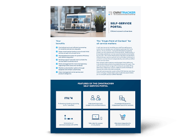
A flexibly configurable self-service portal helps you to structure services using forms and make them centrally accessible to all departments. Our factsheet provides you with all the technical information about the self-service portal at a glance.
Is there a perfect form? A conclusion
You will notice that this small selection of 11 design tips alone, based on established UX design patterns, will significantly improve your form, and certainly also make it more attractive from an aesthetic point of view. But be careful before you get too carried away with the visual appeal of your form. It would be a mistake to overestimate it. Because when it comes to form design, functionality beats design, always. If a design principle leads to a reduction in the expressiveness of the form, you should neglect it. The same applies when it comes to convenience: No matter how convenient a feature may seem to users, if it comes at the expense of performance, then: “Kill your darlings”. Or at least: Take a hard look at existing elements to see if they are really necessary. Because no matter how close you get to the ”perfect form”—your form has to work in any case.
Your design will also be limited or inspired by the depth of functions offered by the respective provider—so it is better to take a close look here before deciding on a tool. When choosing your software provider, it is also advisable to pay attention to what happens to your hard-earned forms when you upgrade to a new version. In the worst-case scenario, this means having to recreate everything because old forms are not compatible with the new version. Another criterion: How complex is the coding behind the form? Low-code options relieve the burden on highly qualified specialists and also enable less experienced team members to design forms. Equally relevant is the extent to which forms can be adapted once they have been created. After all, new form content has to be implemented or intermediate steps removed from time to time in day-to-day business. A high degree of flexibility is easy on the nerves of every system administrator when designing forms—while at the same time ensuring greater satisfaction for customers, partners and internal employees.
Newsletter-Anmeldung
Would you like to stay up to date on digital service management, GRC and automation? In our newsletter, we inform you about relevant blog posts and professional articles. We also regularly send you information about events, DACH-wide trade fairs and our free live sessions in the areas of service management, process automation, GRC and analytics with business intelligence. We will inform you about new features of the OMNITRACKER business process platform.